Iron blue pigments are important in printing, especially rotogravure, because of their deep hue, good hiding power and economic cost/performance-basis. Iron blue is often mixed with phthalocyanine pigments for multicolor printing. Another important use is in controlling the shade of black printing inks. Typical amounts used are 5-8% for full shade rotogravure inks and 2-8% for toning black gravure and offset inks.
Iron blue pigments are used in the manufacture ofsingle — and multiple-use carbon papers and blue copying papers, both for toning the carbon black and as blue pigments in their own right [3.172].
|
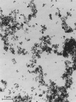
Fig. 3.20 Electron micrograph of an iron blue pigment of small particle size (Manox® Blue 460 D). |
Toning of Black Gravure Inks
For the toning of black gravure inks, for example, 2 to 6% of Manox® Easisperse® HSB3 are used together with 6 to 12% of carbon black. Combinations with red pigments with a blue undertone are also common. When using organic pigments, resistance to solvents must be taken in account. Because of the poor dispersibility of iron blue compared with carbon black it is both economical and practical to disperse the blue pigment in a separate step.
While the visual judgment of black is influenced by the individual ability of the observer to distinguish small color differences in deep black, it is possible, with the help of photometric measurements, to graphically interpret objective evaluations by means of physical data [3.186].
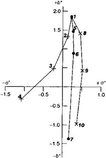
Figure 3.24 illustrates the color changes of a low structure LCF-type carbon black by addition of Pigment Blue 27 (Vossen-Blau® 705) and Pigment Violet 27 or by toning with a 4:1 combination of Pigment Blue 27 and Pigment Red 57:1. A mixture of asphalt resin, calcium/zinc resinate and phenol resin was used as a binder. The pigment concentration for all was 13.2%. The toner was added in 2.2% steps up to 6.6% with a simultaneous reduction from 13.3% to 6.6%.
|
|
|
Toning of Black Offset Printing Inks
The basic requirements for the successful use of iron blue as a toning agent in offset printing inks are resistance to damping or “fountain” solutions and good dis-
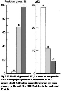 |
TiO2 (rutile) relative to the iron blue pigment after 1000 h fast exposure to UV [3.185]. a) Without clearcoat, b) with clearcoat but without UV protection, c) with clearcoat and UV protection.
persibility. “Resistance” is understood here as the hydrophobic characteristics of the pigment.
This property prevents wetting of the pigment by water and therefore its peptization. Non-resistant iron blue can render the ink useless by adsorbing water to above the normal content. A negative side effect of peptization is the “dissolution” of the blue pigment from the printing ink and the resulting blue coloration of the fountain solution with the familiar problems of printing-plash contamination, which is known as scumming or toning.
The combined dispersion of pigments is only practical with colorants of similar dispersibility. Toning agents with a considerably higher resistance to dispersion than carbon black are therefore delivered by the manufacturer in the form of a predispersed paste or must be ground separately by the user.
Developments in the fields of iron blue technology have overcome these problems. A new generation of pigments has been generated which covers both the demand for a sufficient resistance against damping solutions and the request for a good dispersibility. Easily dispersible iron blue is preferred to be used for combined dispersion with carbon black in the so-called “co-grinding” process.
In the following section, the coloristic effects of these iron blue pigments are described, as obtained in toning experiments involving a LCF-type carbon black, in comparison with Pigment Blue 15:3 and Pigment Blue 61 (Figs. 3.24-3.26).
|
|
Fig. 3.24 Color coordinates of black gravure inks with different toning. 1: Pigment Black LCF = Printex® 35, + 2-4: Pigment Black LCF/Vossen-Blau® 705, *5-7: Pigment Black LCF/[VB 705 — Pigment Red 57:1 (4:1)], x 8-10: Pigment Black LCF/[VB 705 — Pigment Violet 27 (2:1)].
The pigment concentration of the inks is 24%, i. e. the amount of carbon black was reduced, corresponding with the addition of 3, 6, or 9% of blue pigment. Black inks containing 15 to 24% of carbon black are excluded from this experiment. They are presented to give an additional coloristic description of “pigment” black as regards the development of the hue when used as a self-color pigment in increasing concentrations.
In the visual and the colorimetric evaluation, the color location change of the carbon black when used as a self-color pigment is noticeable since there is a tendency to a black with a blue undertone at higher pigment concentration, even without the addition of toning agent. In Figure 3.25 these are the color locations 1, 2, 3 and 4 starting with 15% carbon black and in increasing additions in steps of 3 to a maximum concentration of 24%.
However, it is also clear that without the addition of a blue pigment the achromatic point cannot be achieved.
By adding various toning agents the desired color hue is achieved — although with varying red-green spread. Iron blue (Manox® Easisperse® 154) brings about a clear shift towards green with a relatively small shift in the blue direction (see color locations 5, 6 and 7). The required target is more successfully achieved by the use of a mixture of iron blue and Pigment Red 57:1 in the ratio 4:1. The color locations 8, 9 and 10 illustrate useful ways of approaching the achromatic point with the addition of 3, 6, and 9% of the mixture.
The addition of 3% of Pigment Blue 61 already results in a significant step towards blue/red and shows almost identical incremental changes with further additions (see color locations 11, 12 and 13). In addition, the bronze effect occurs, intensifying with increasing distance from the achromatic point. With Pigment Blue 15:3 in numerically equivalent increments, the hue of the black ink moves towards blue/green in the opposite direction from the achromatic point and with a negative shift (color locations 14-16).
3.6.4.2
 27 ноября, 2015
  Pokraskin
 Опубликовано в рубрике